HARRISON’S RESTAURANT
Branding and deliverables for Harrison’s Wine Bar & Grille with a multicutural flair
ABOUT THE PROJECT
Harrison's Wine Bar & Grille strives to create an atmosphere that is socially responsible by supporting the local community. Their dinner menu has a range of options that includes cuisine from diverse cultures.
I centered the restaurant’s brand identity on reflecting diversity and multiculturalism in order to reflect their value of an inclusive community. Given that Harrison’s restaurant is located in a remote town in Pennsylvania, developing a multicultural brand identity for their business also promotes culture in a location where it is limited.
RESEARCH
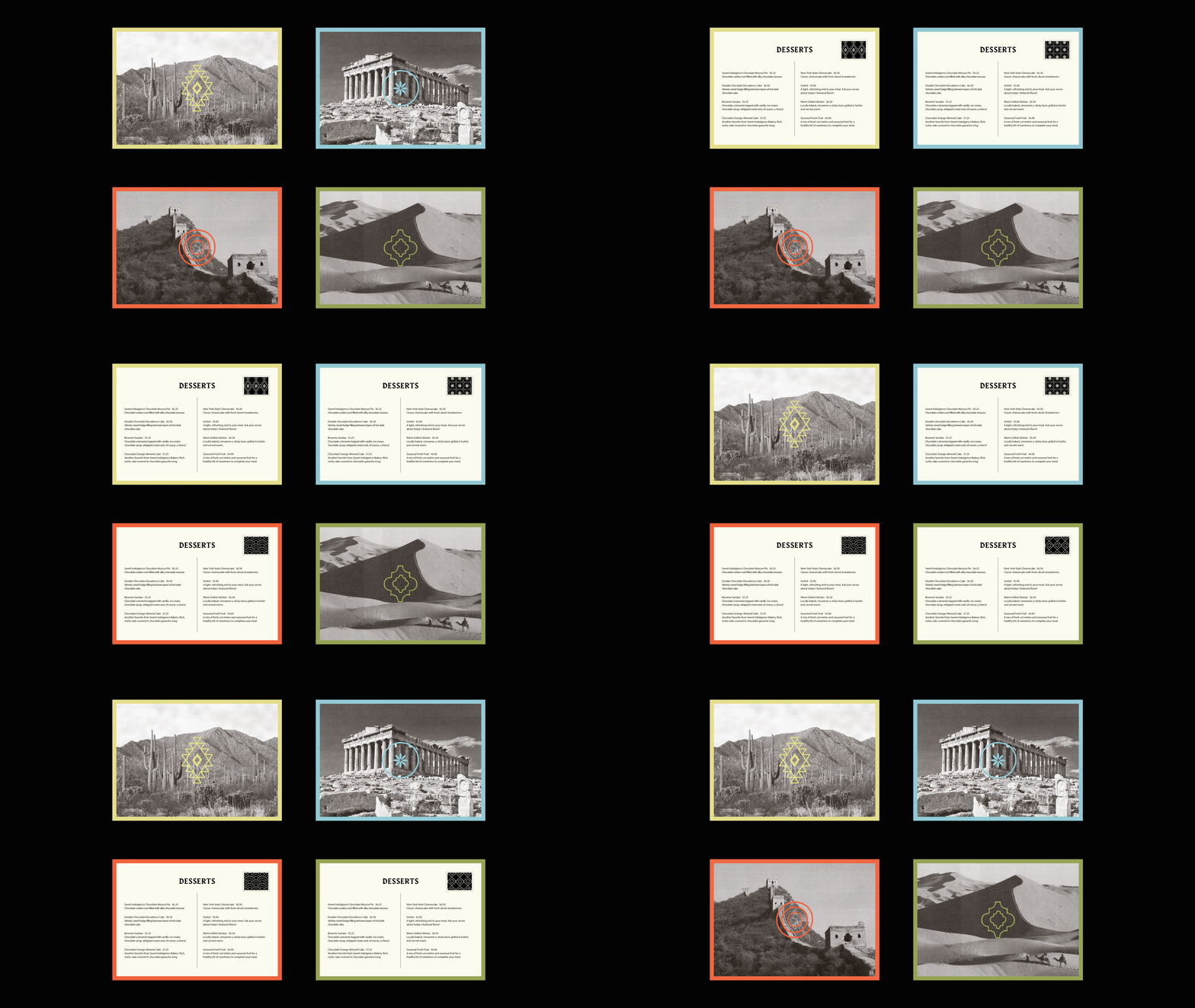
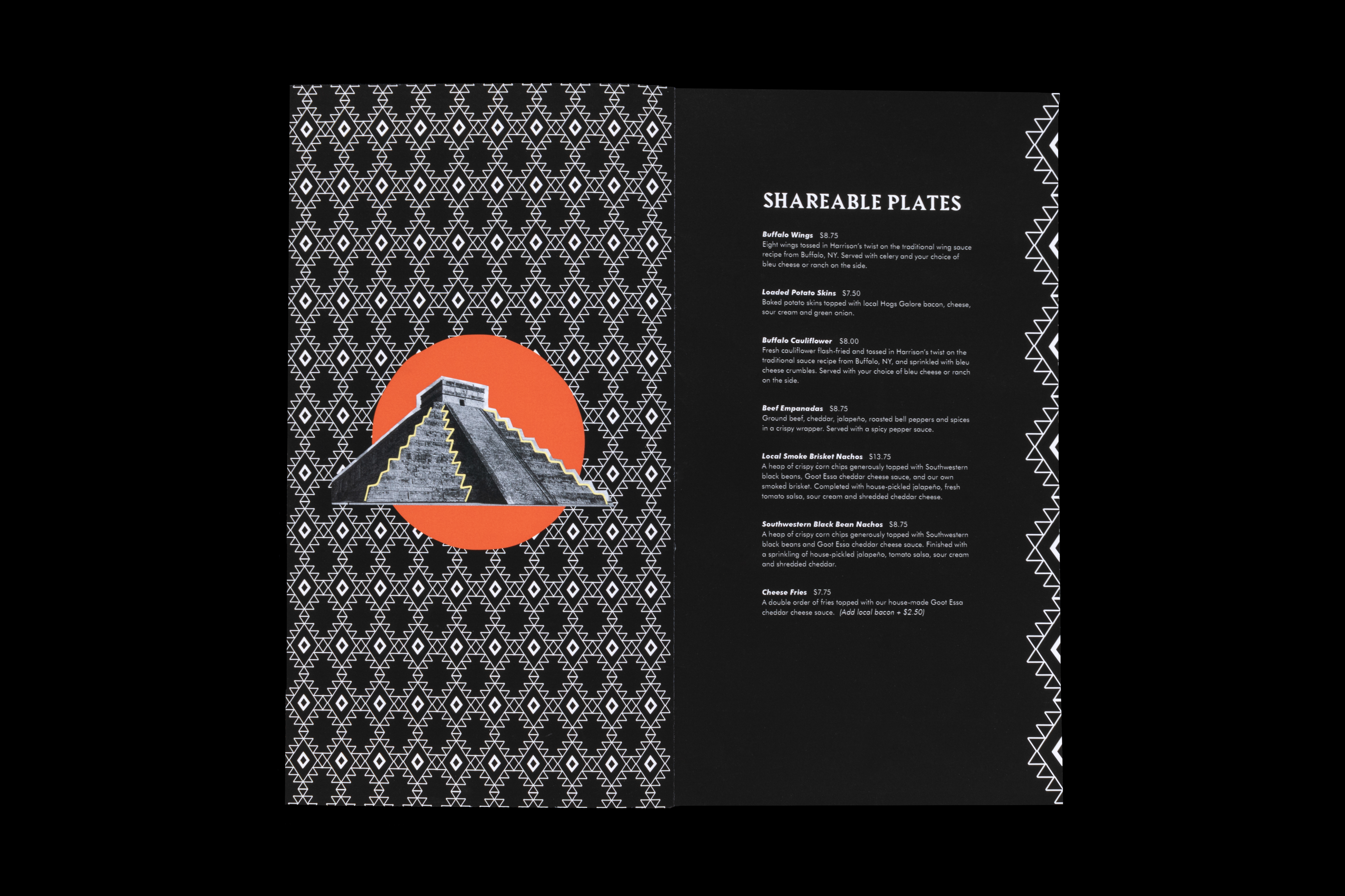
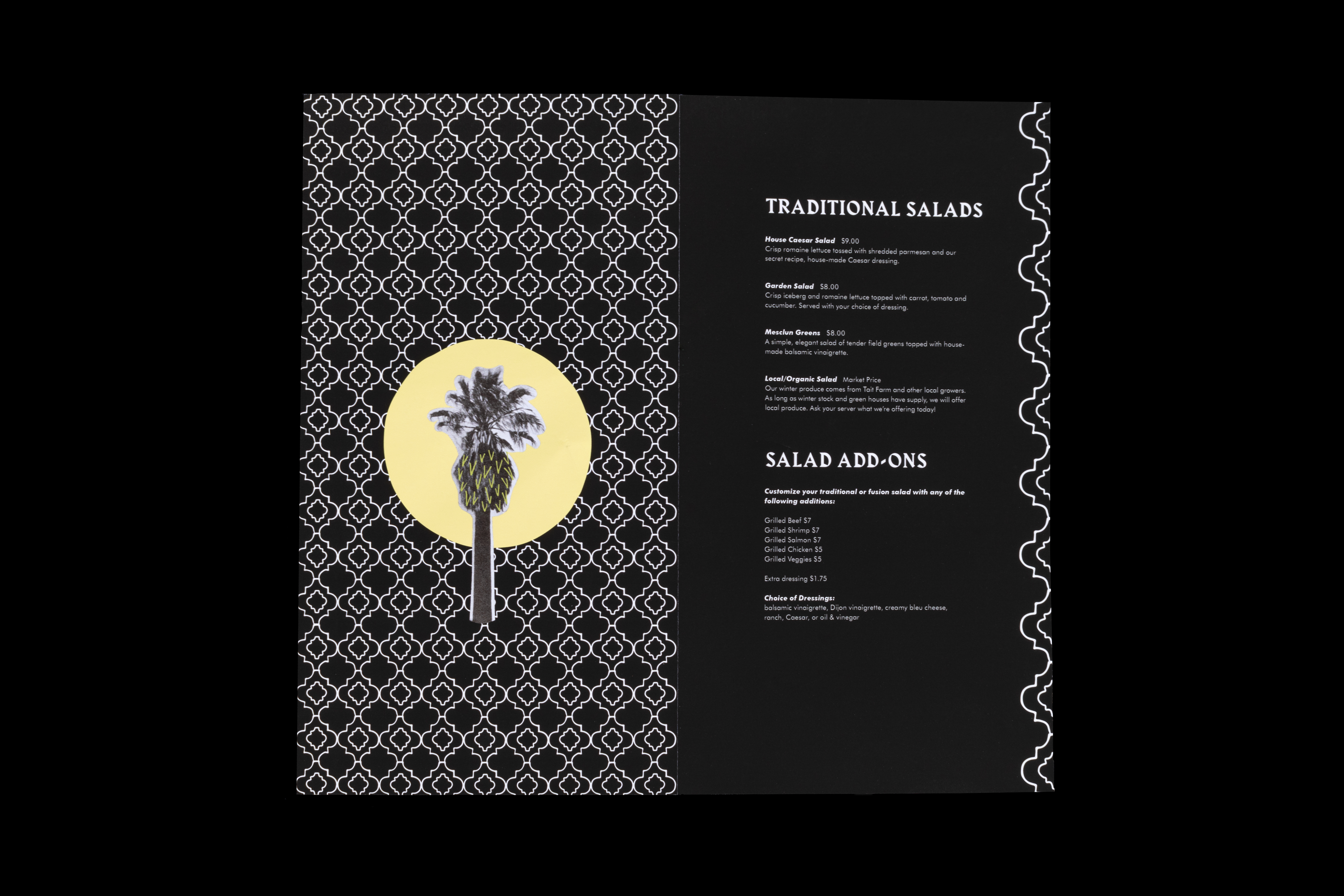
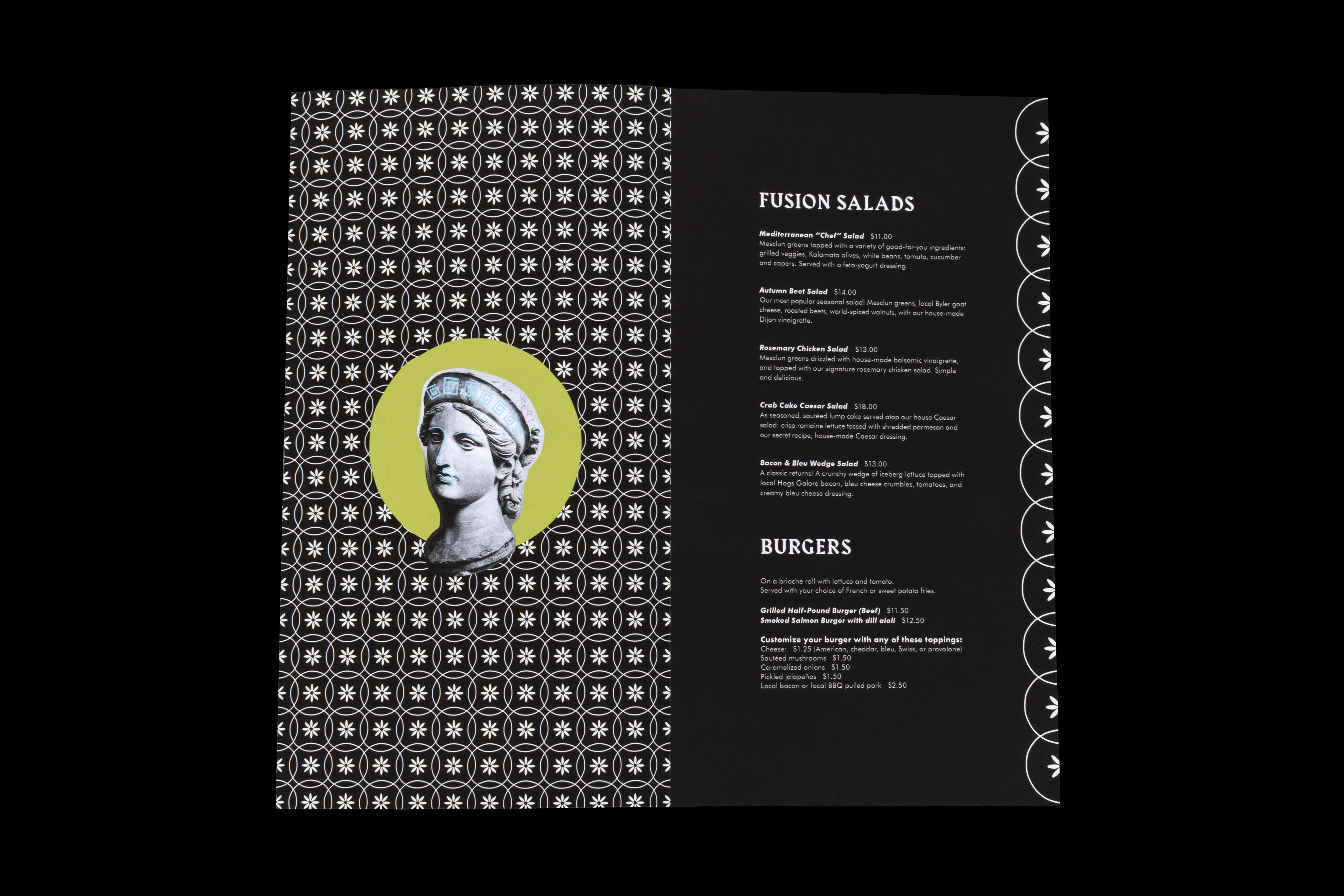
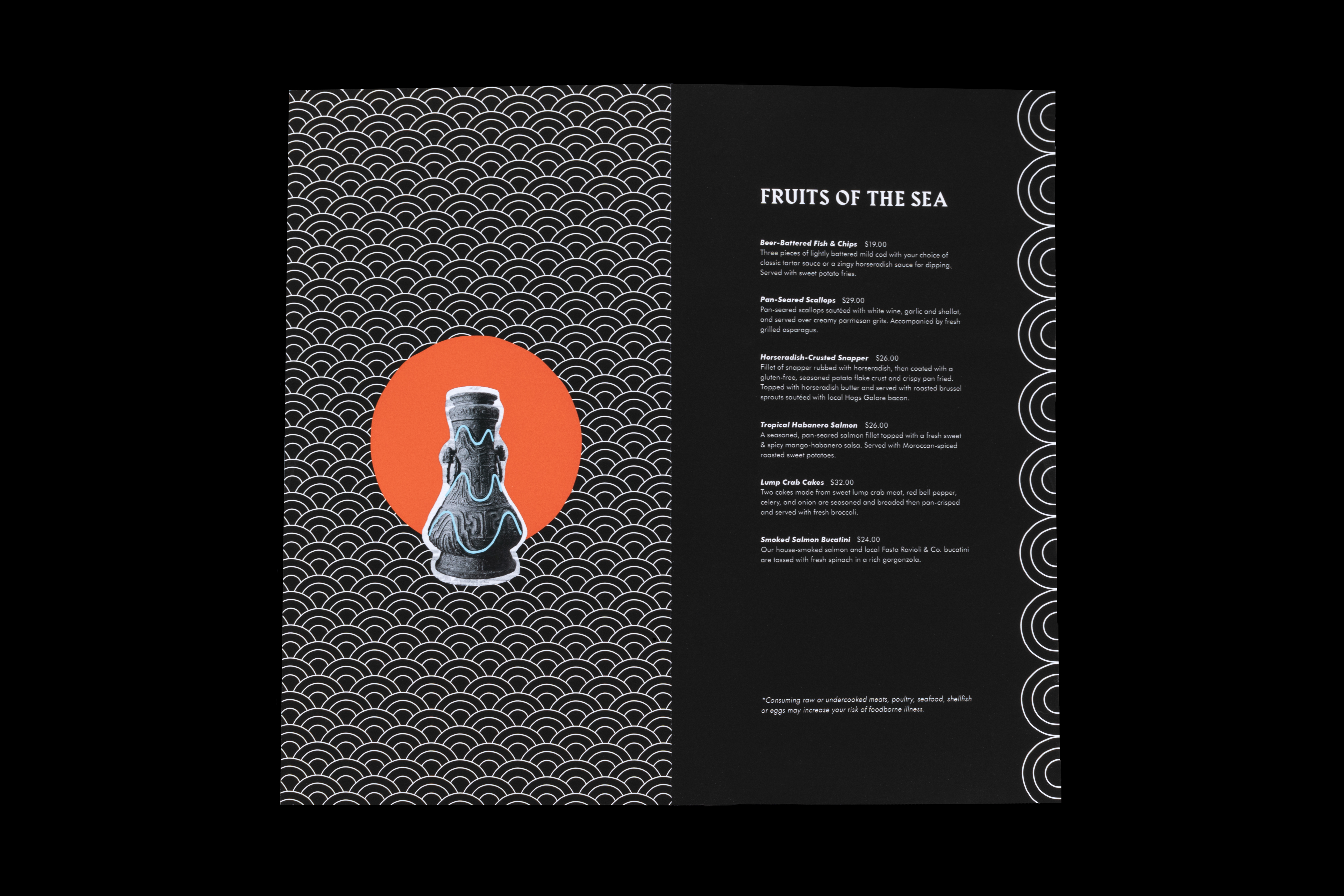
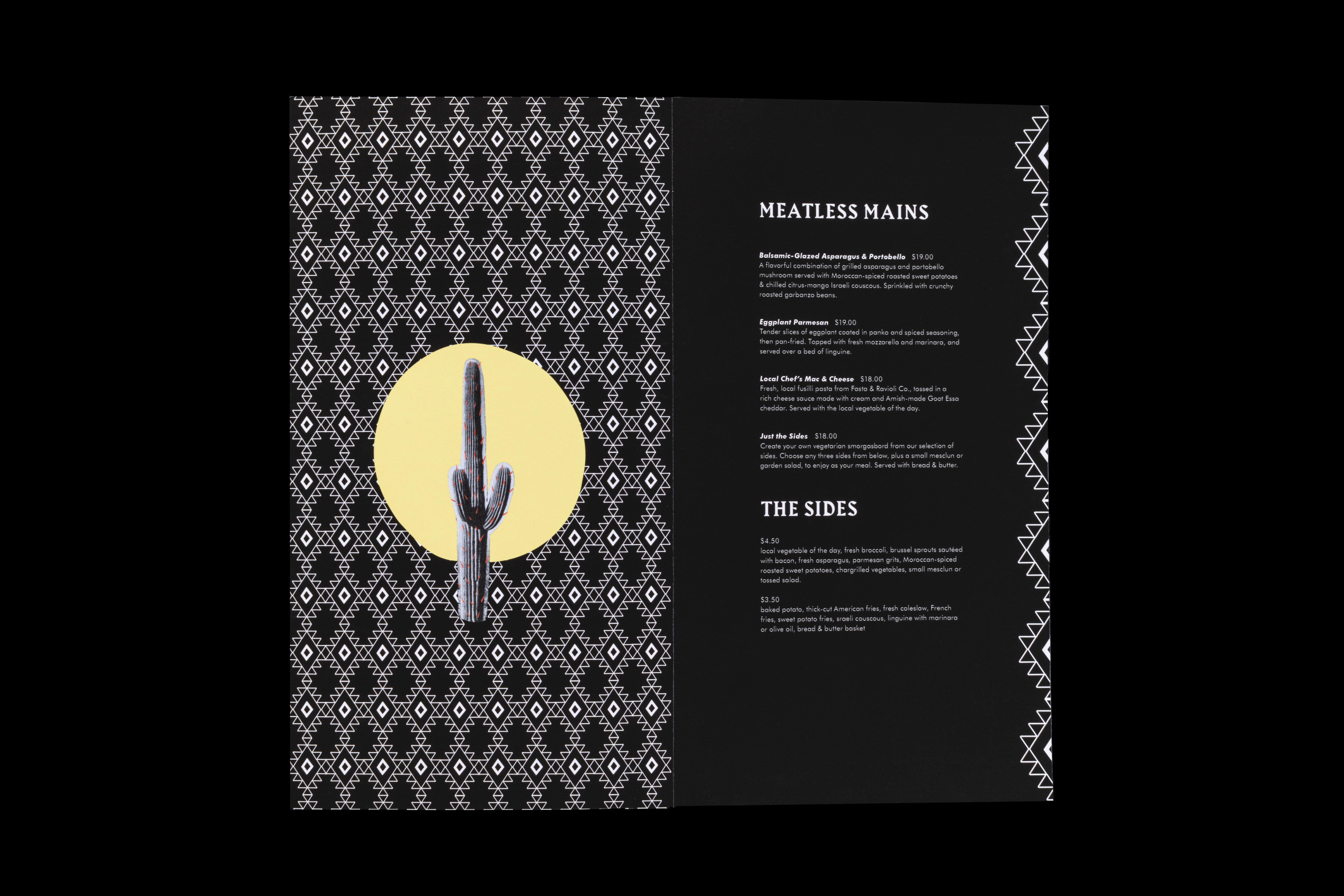
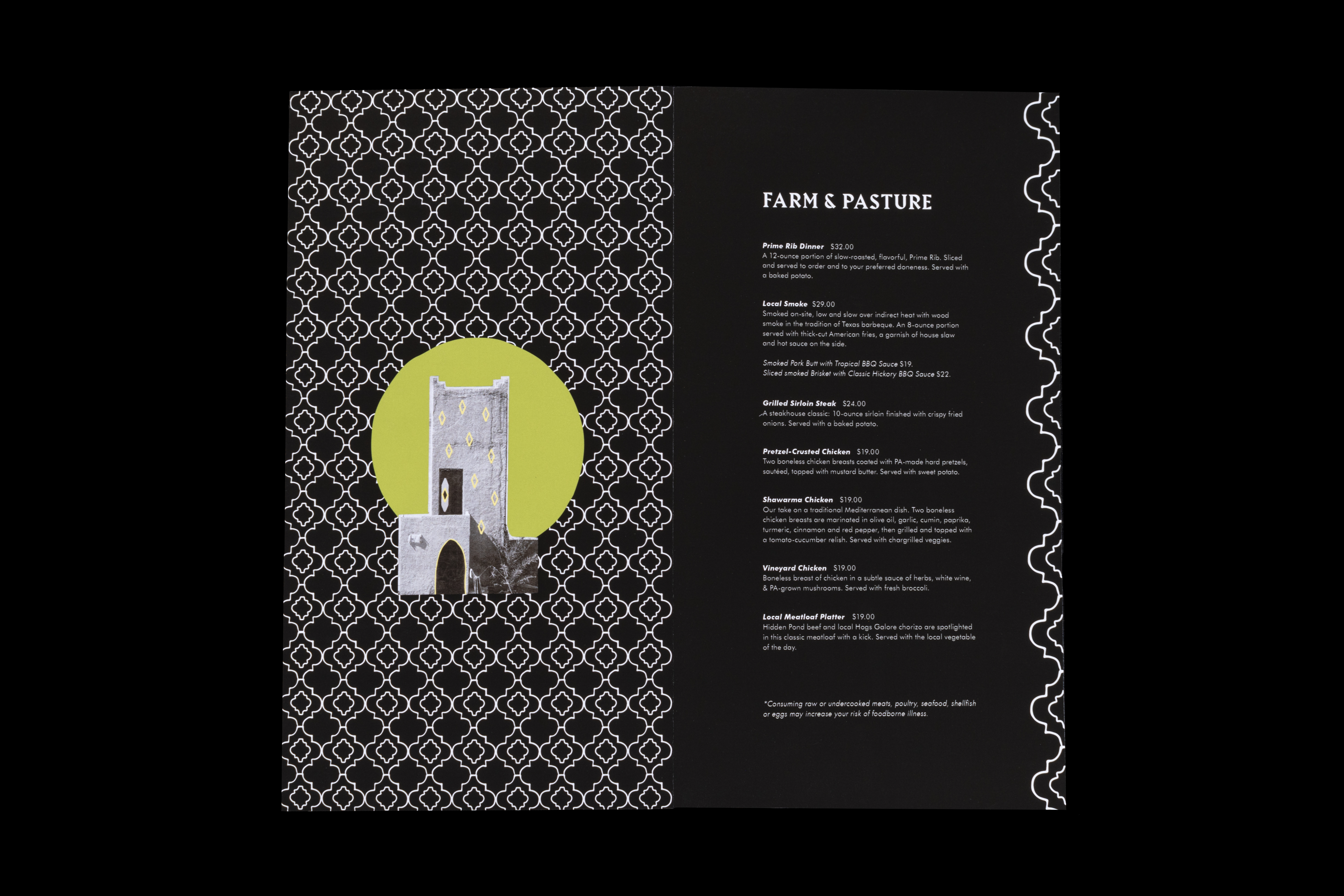
I researched four specific countries–China, Greece, Morocco, and Mexico–to represent different continents and correlate to the food offered at Harrison’s restaurant. Aspects of each country’s culture such as geographic landscape, traditional patterns, artifacts, architecture, animals, and their national flag were then utilized as inspiration for imagery.
STYLIZATION
The color palette was determined based on the primary colors found in each country’s flag. I chose a humanistic serif typeface for the display text which compliments the stylistic elements of each culture.
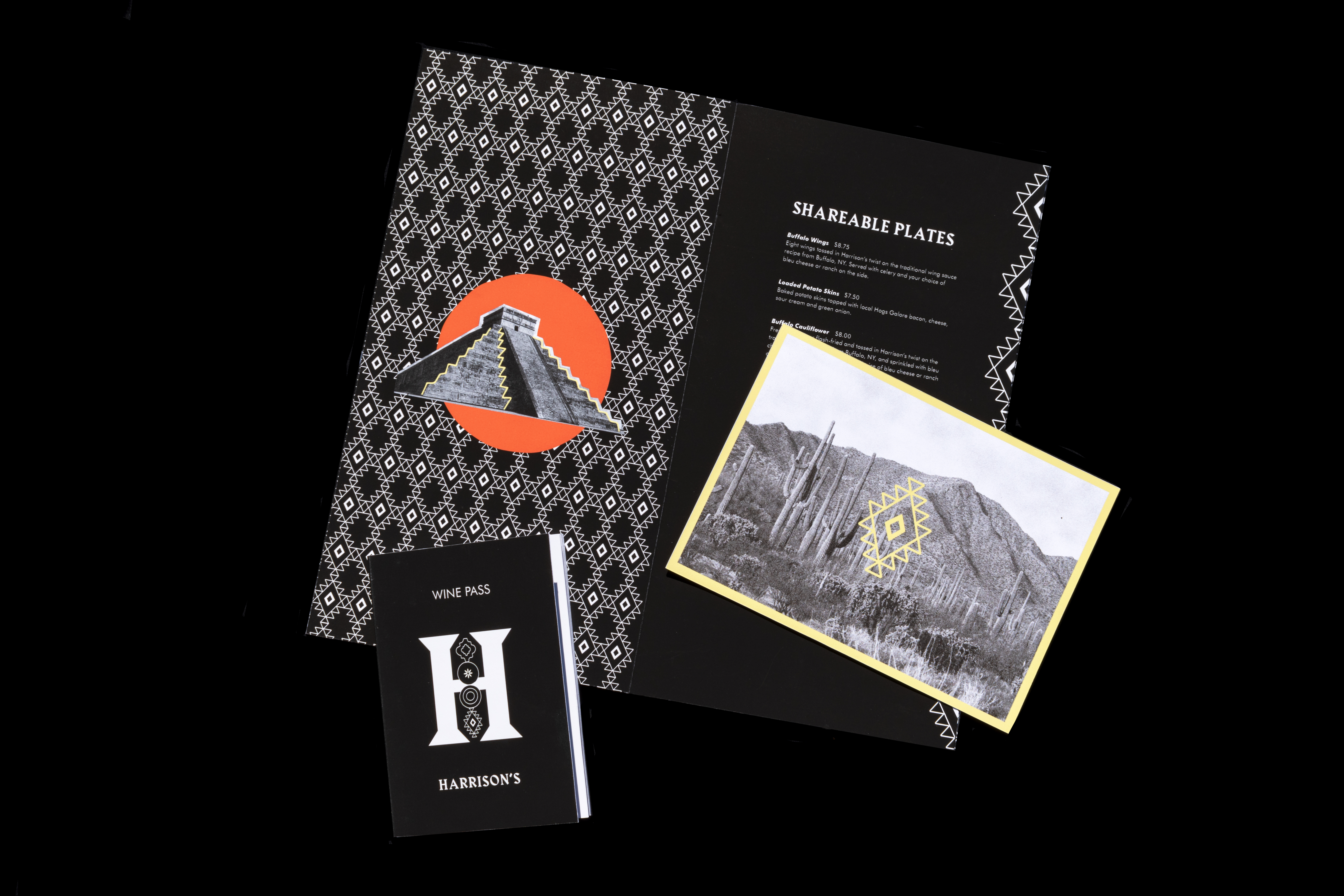
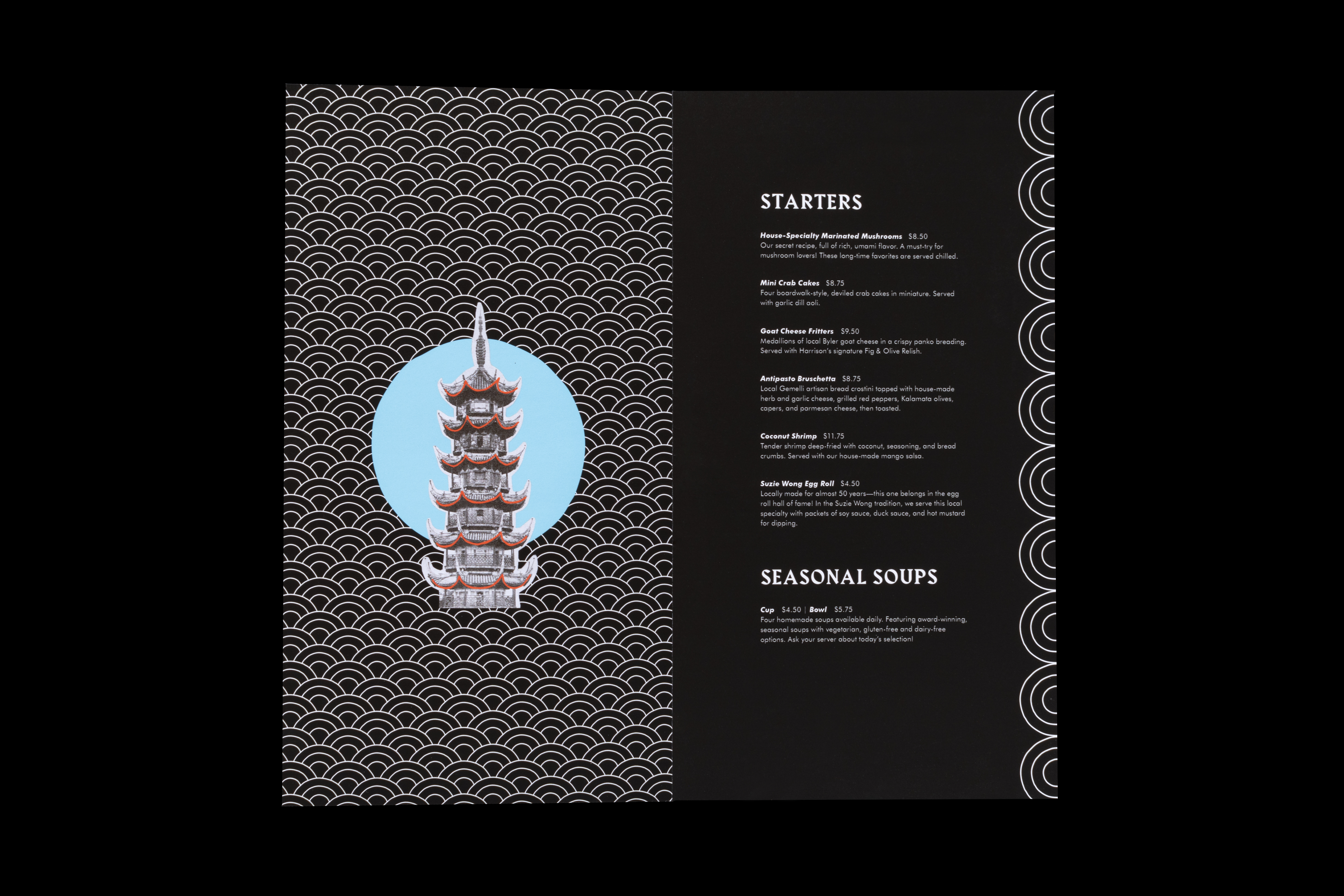
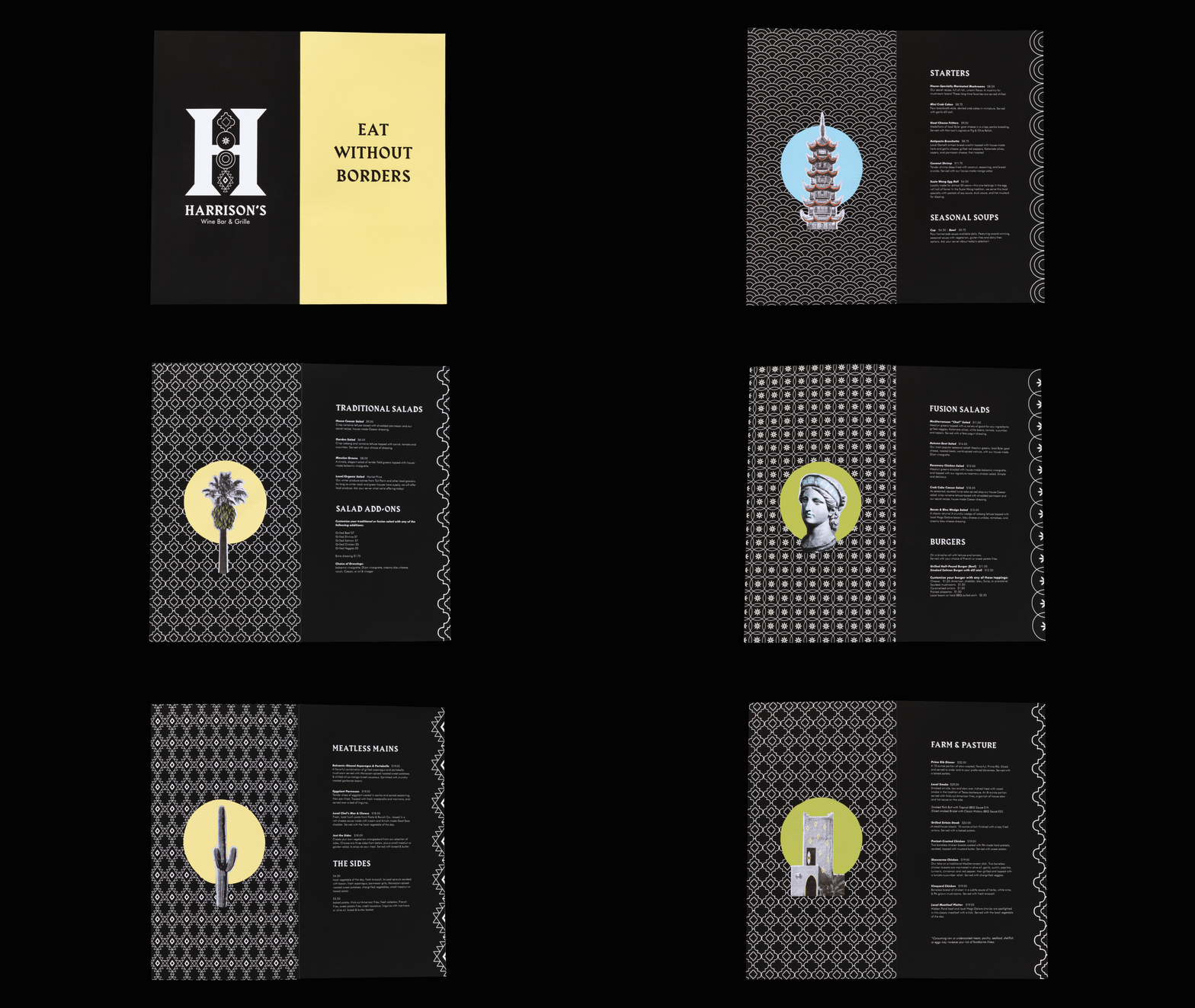
By collaging illustrated patterns and motifs with found photographs from different parts of the world, I created a playful and eclectic stylization.
I also designed the imagery to appear highly textured and tactile in order to be more engaging to the audience. The hand-drawn linework and patterns allude to embroidery and fabrics that are significant to the heritage of the four chosen cultures. The texture of the photographs was executed by printing found imagery from each country on a low-quality black and white printer, then cutting the images out and scanning them back into the computer. After some experimentation, I found that this process produced a natural grainy texture created by the ink dots in the printing, and it also was the most effective in maintaining stylistic cohesion across all the imagery.

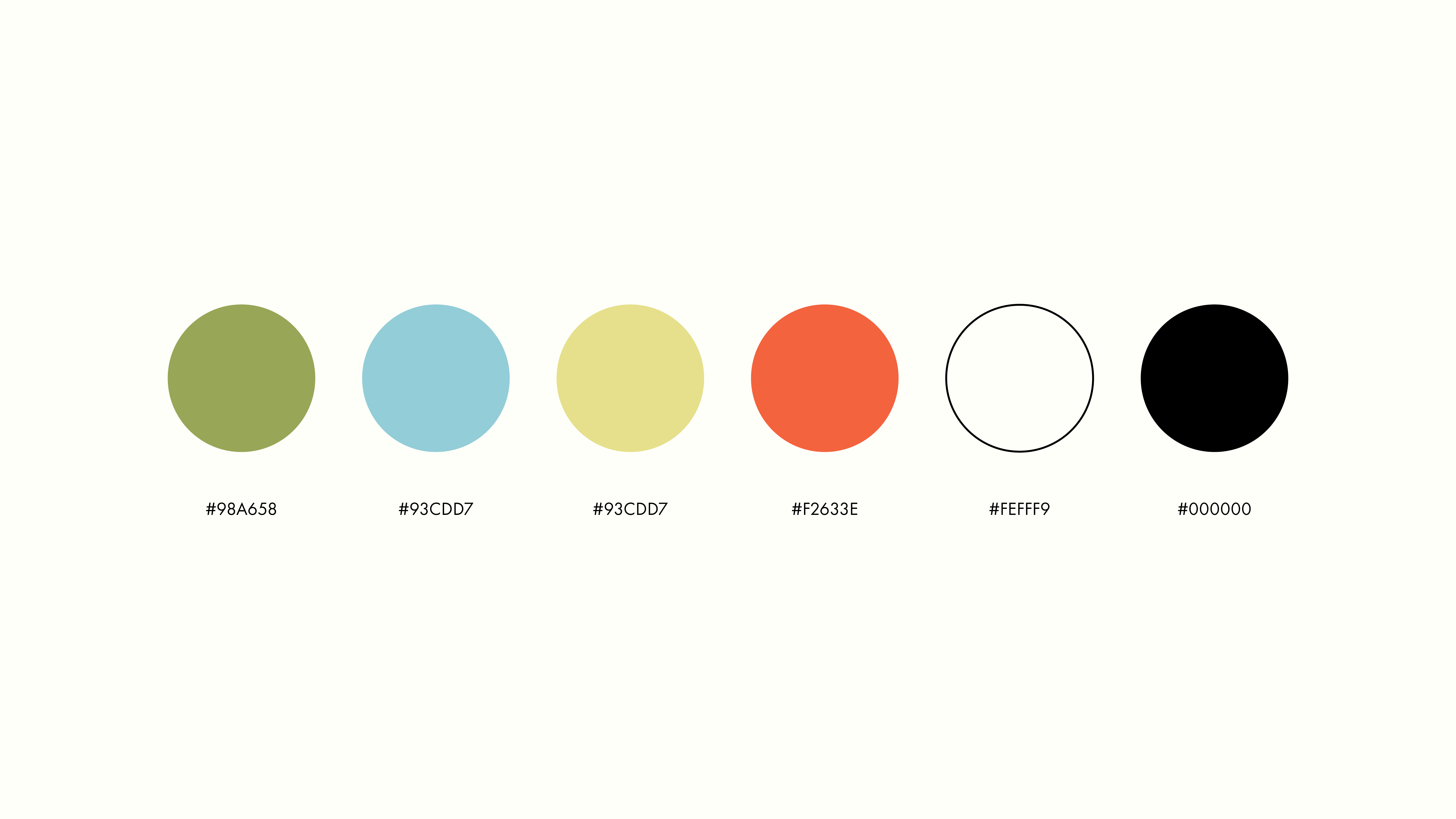
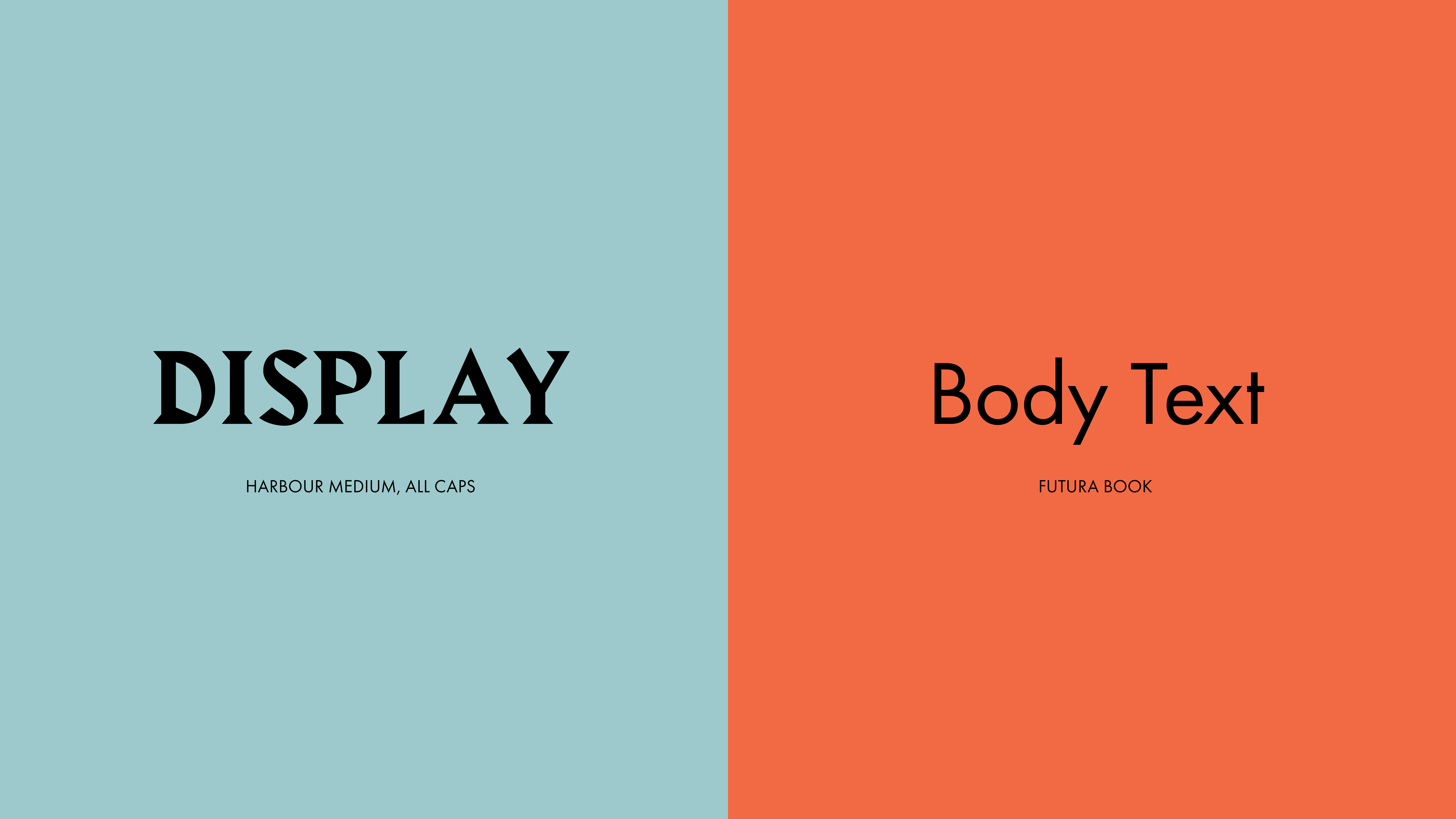
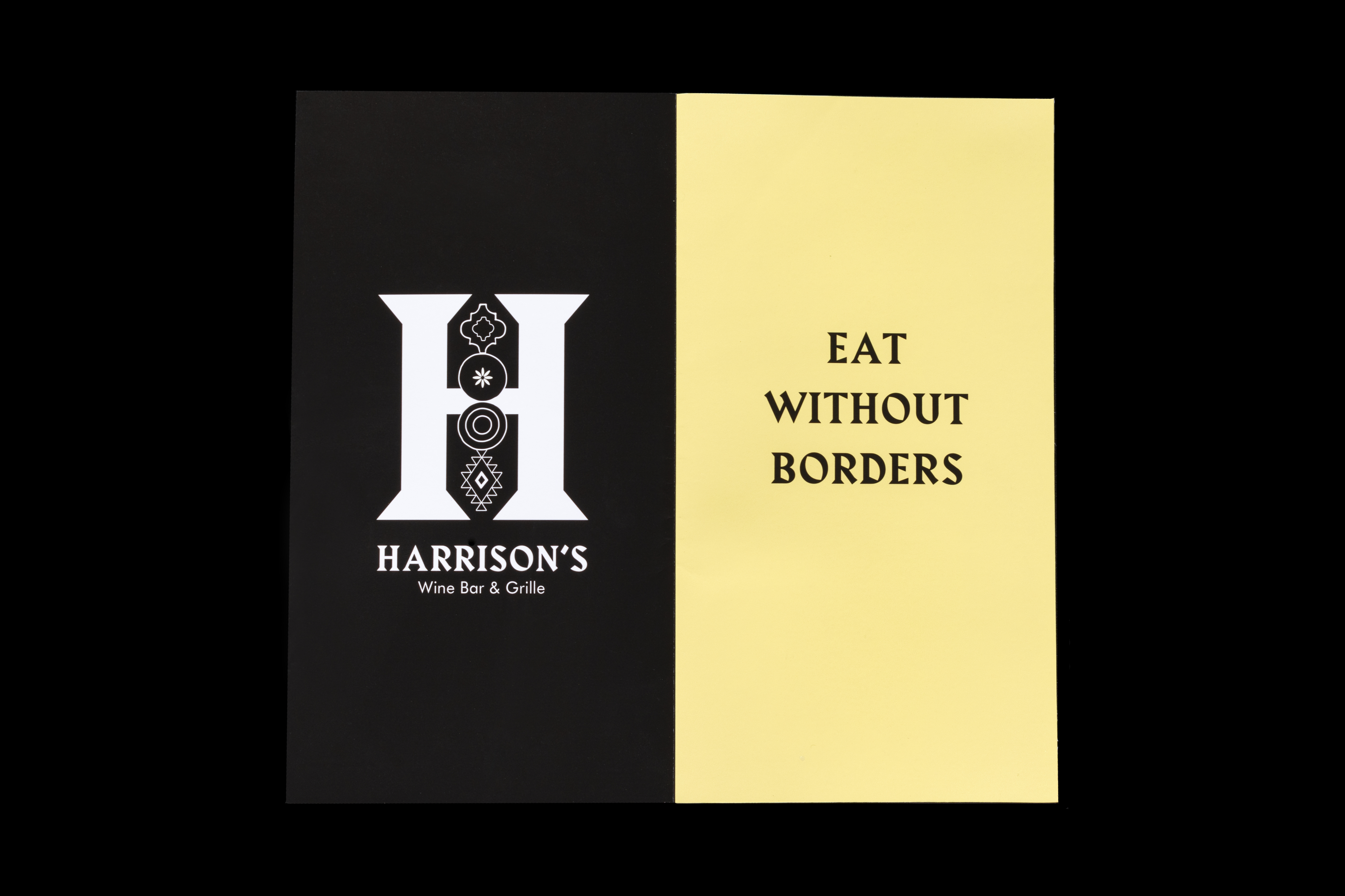
Brand logo, marks, color pallette, and typography
SOLUTION
The final deliverables reference objects that are associated with traveling in order to provide a more engaging experience with dining at the restaurant. The dessert menus are laid out like postcards, and the “Wineport” is a rewards card modeled after a passport where guests can track their progress towards a free bottle of wine with stamps in their booklet.
The overall branding ties together various cultures through a consistent, eclectic, and quirky style. It also supports the ethos of Harrison’s restaurant through an appreciation for diverse cultures.
This project allowed me to gain experience in developing comprehensive brands as I was responsible for all conceptualization, branding, illustration, layout, and typography.
