
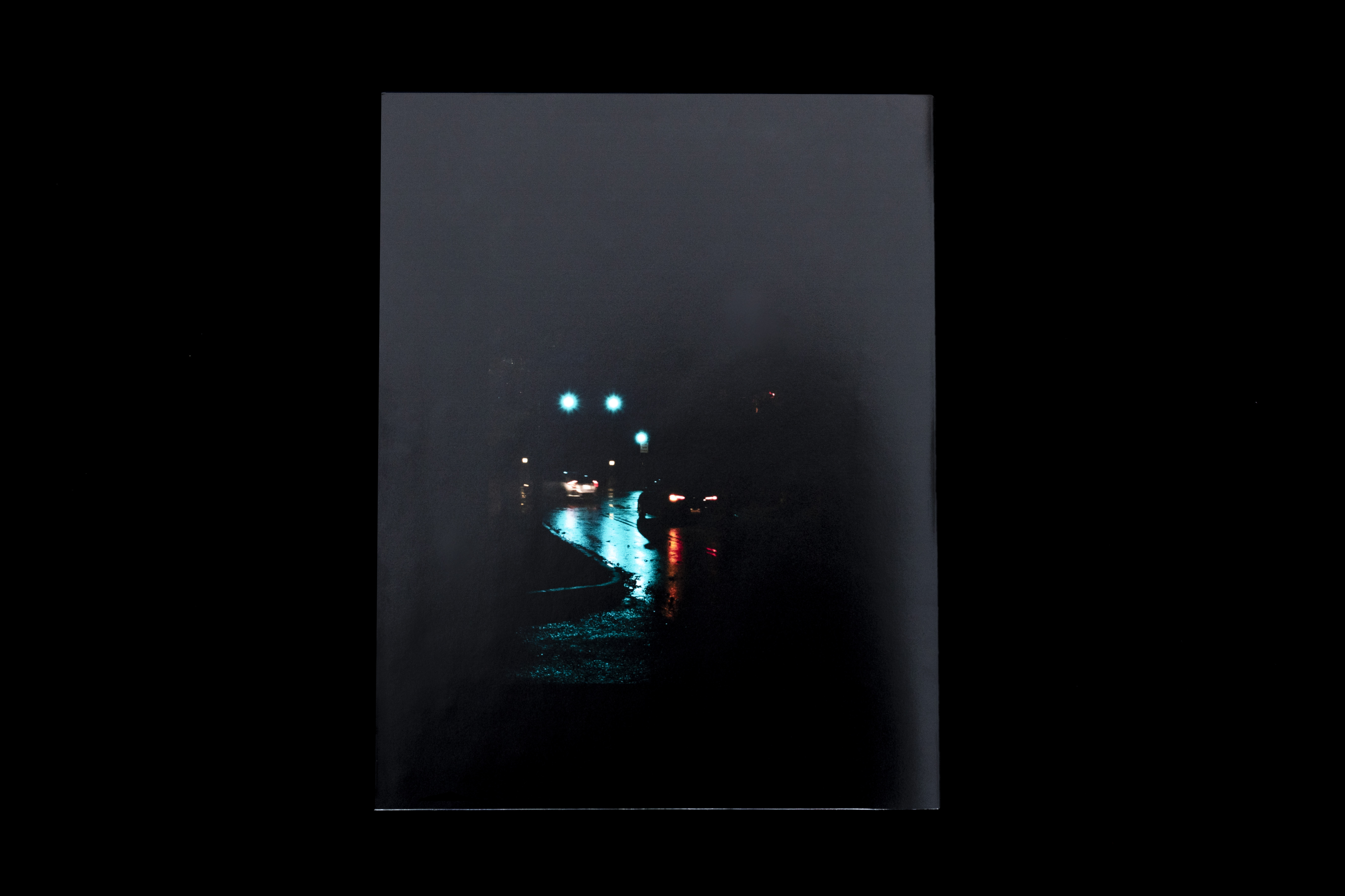
OH MAGAZINE
Fashion editorial inspired by the documentary ShirkersABOUT THE PROJECT
INSPIRATION
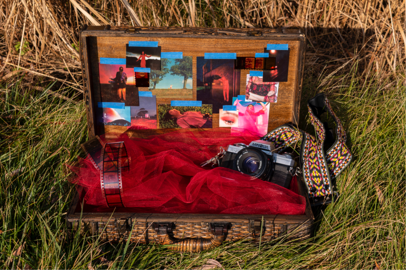
When I first watched Shirkers, I was mesmerized by how the dreamy way it was filmed, combined with the film score, gave an eerie, surreal feeling. To give background on the documentary, it is a stranger-than-fiction true life story about the making of a film entitled Shirkers that never got produced. It was the first road movie filmed in Singapore in 1992 by nineteen-year old Sandi Tan, her two friends, and their film teacher, George Cardona. Sandi Tan wrote the film, as well as starred as the heroin, S., a teenage killer who runs away and kidnaps children to save them from adulthood. George Cardona kept the film to develop it as Tan and her friends parted for college; however, the film disappeared along with Cardona as he withheld the footage and never stayed in contact with them. The documentary is a retrospective of Tan and her friends recovering the old footage and trying to understand Cardona’s motives. The original film Shirkers had great potential and it’s a shame it was never produced, but the mystery and tragedy that came of an already adventuresome and strange story interested me even more.
The film had a memorable impact on me, but what was even more compelling was that I felt a personal connection with Sandi Tan. Tan mentions in the documentary that as a teenager, she was obsessed with Catcher in the Rye and the Velvet Underground, which is my favorite book and favorite band. Tan also worked for an alternative music magazine, which has always been one of my aspirations as a designer. Tan’s DIY film-making inspired me to go out and create my own story.
The film had a memorable impact on me, but what was even more compelling was that I felt a personal connection with Sandi Tan. Tan mentions in the documentary that as a teenager, she was obsessed with Catcher in the Rye and the Velvet Underground, which is my favorite book and favorite band. Tan also worked for an alternative music magazine, which has always been one of my aspirations as a designer. Tan’s DIY film-making inspired me to go out and create my own story.

PROCESS
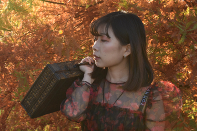
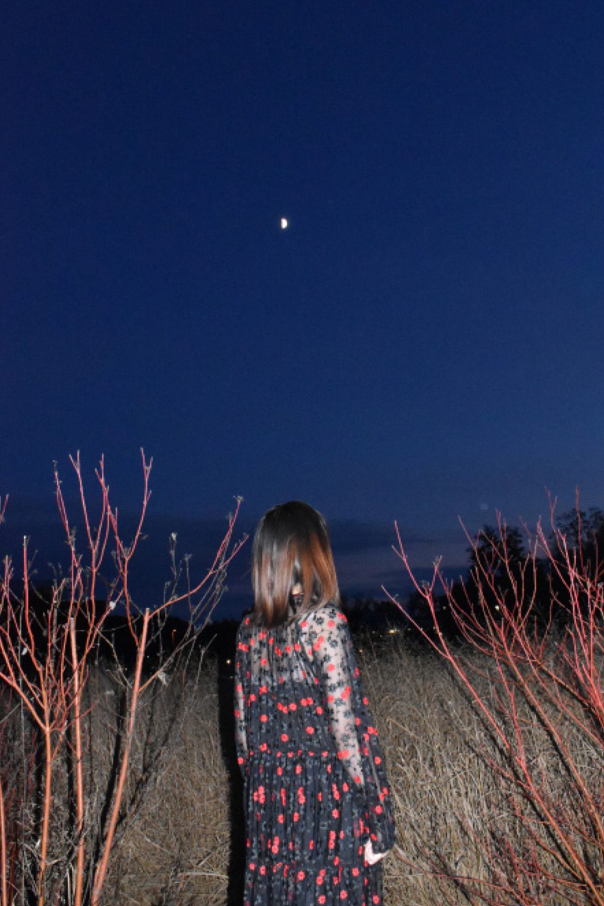
The execution process began with scouting locations that could be utilized for the photoshoot. I knew I wanted the location to be outdoors and show a journey with cars and roads to allude to the concept of a road movie. I photographed test shots at several locations with two different models before finding the final model for the magazine that best fit the part.
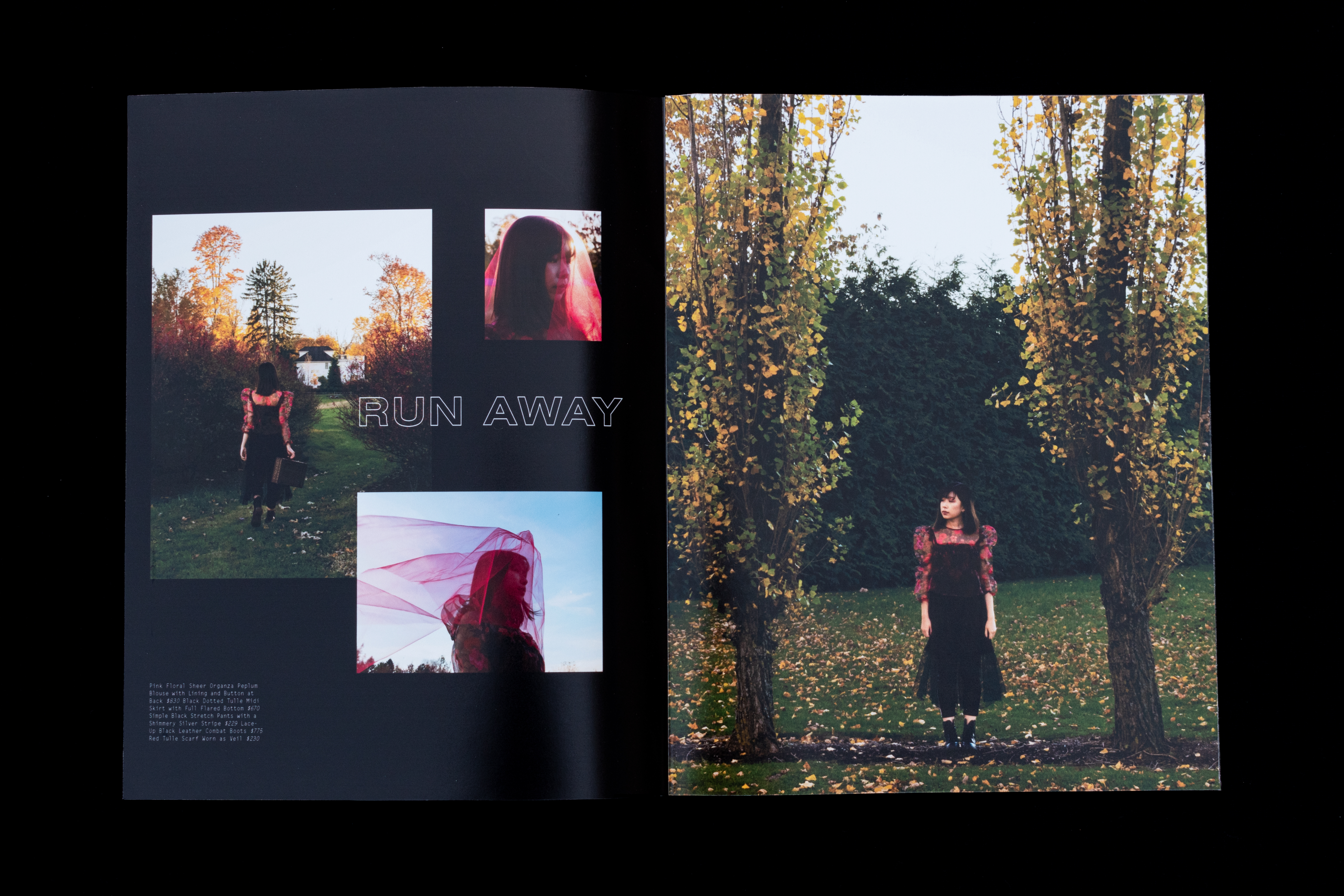
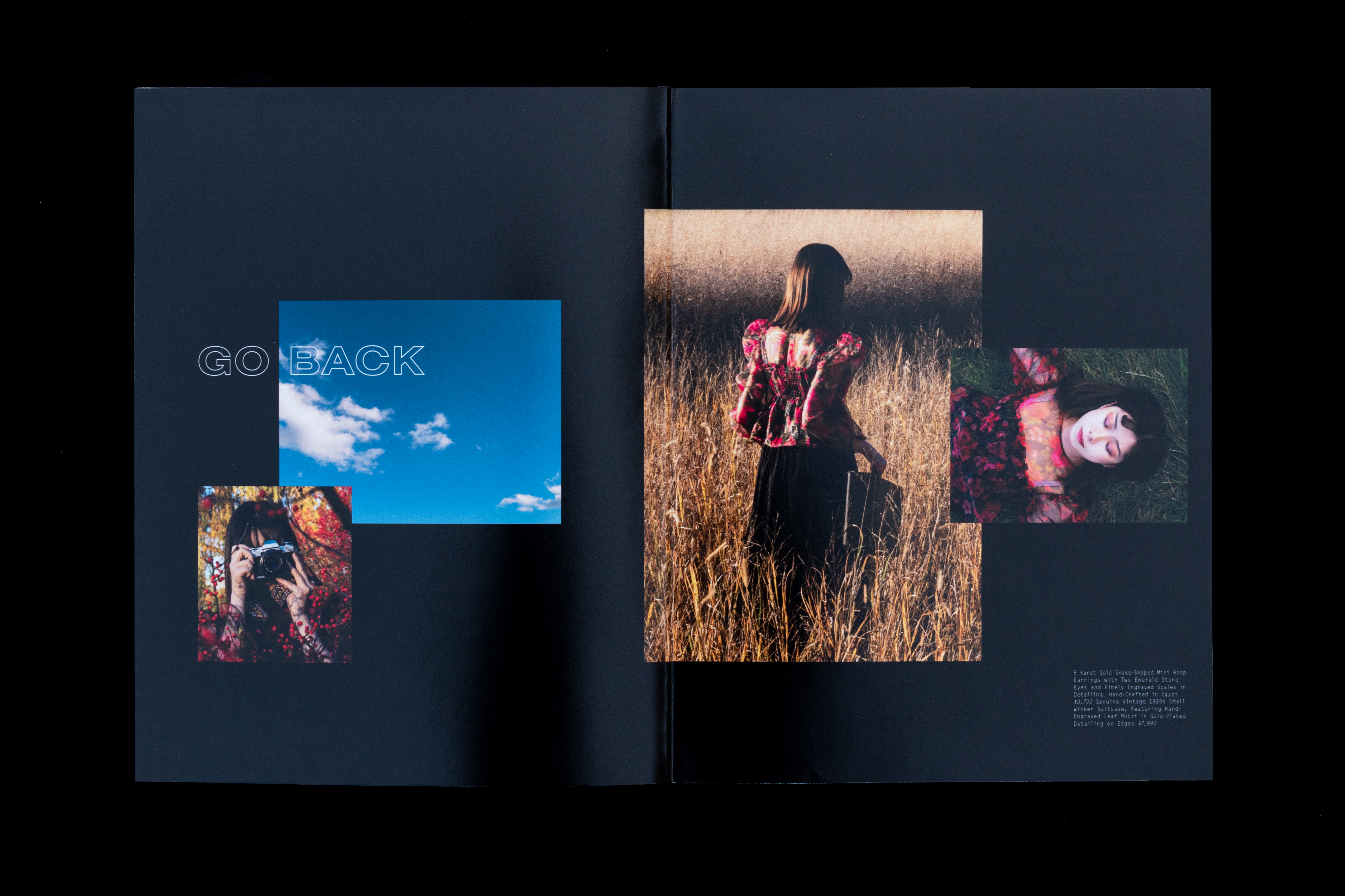
Once finding the perfect model, I developed a clearer idea of how the clothing would be styled. I chose costuming with sheer fabrics like organza and tulle to convey the idea of transparency, and used a tulle veil to cover the model’s face to indicate mystery. The magenta blouse was a reference to the pink shirt S. wears in Shirkers, and the floral prints of both outfits, along with the black combat boots, were influenced by 90’s fashion. The props of the brown suitcase and film camera were also significant throughout the movie.
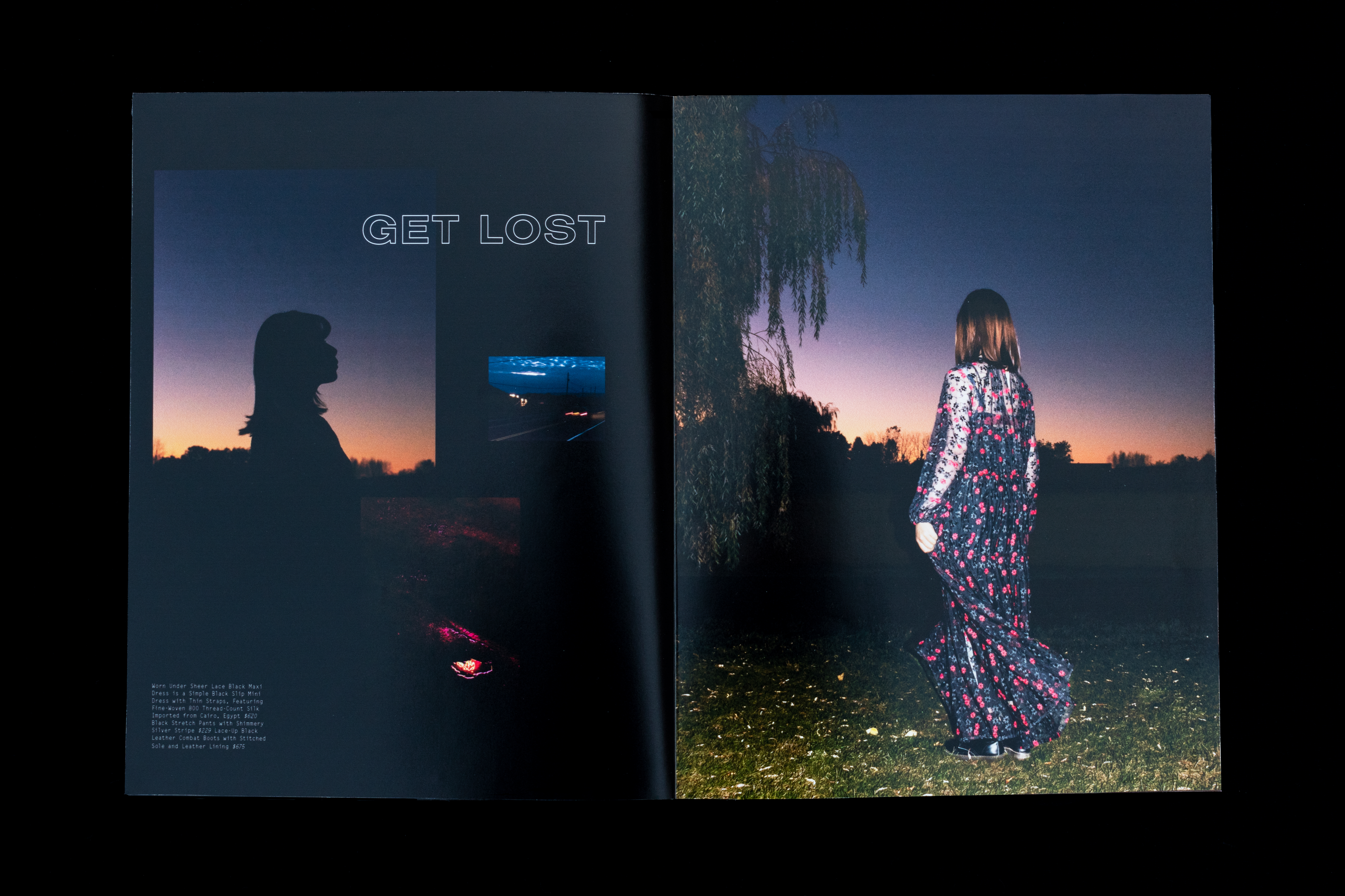
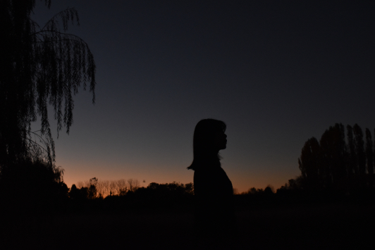
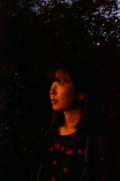
I envisioned from the beginning the layout of the photos on each spread in sequential order from light to dark since the film becomes more ominous as the story proceeds. Therefore, I experimented with taking photos of my model during daytime, sunset, and nighttime at various locations, as well as textural and ambient images without the model. It was important to me that the photographs appeared natural and unposed so that it felt like the viewer was watching this journey take place without the model’s awareness, just as Tan was not aware of the unforeseen circumstances of confiding in Cordona. I chose photographs where the model never looks directly into the camera to symbolize the idea of being blind to a situation.
SOLUTION
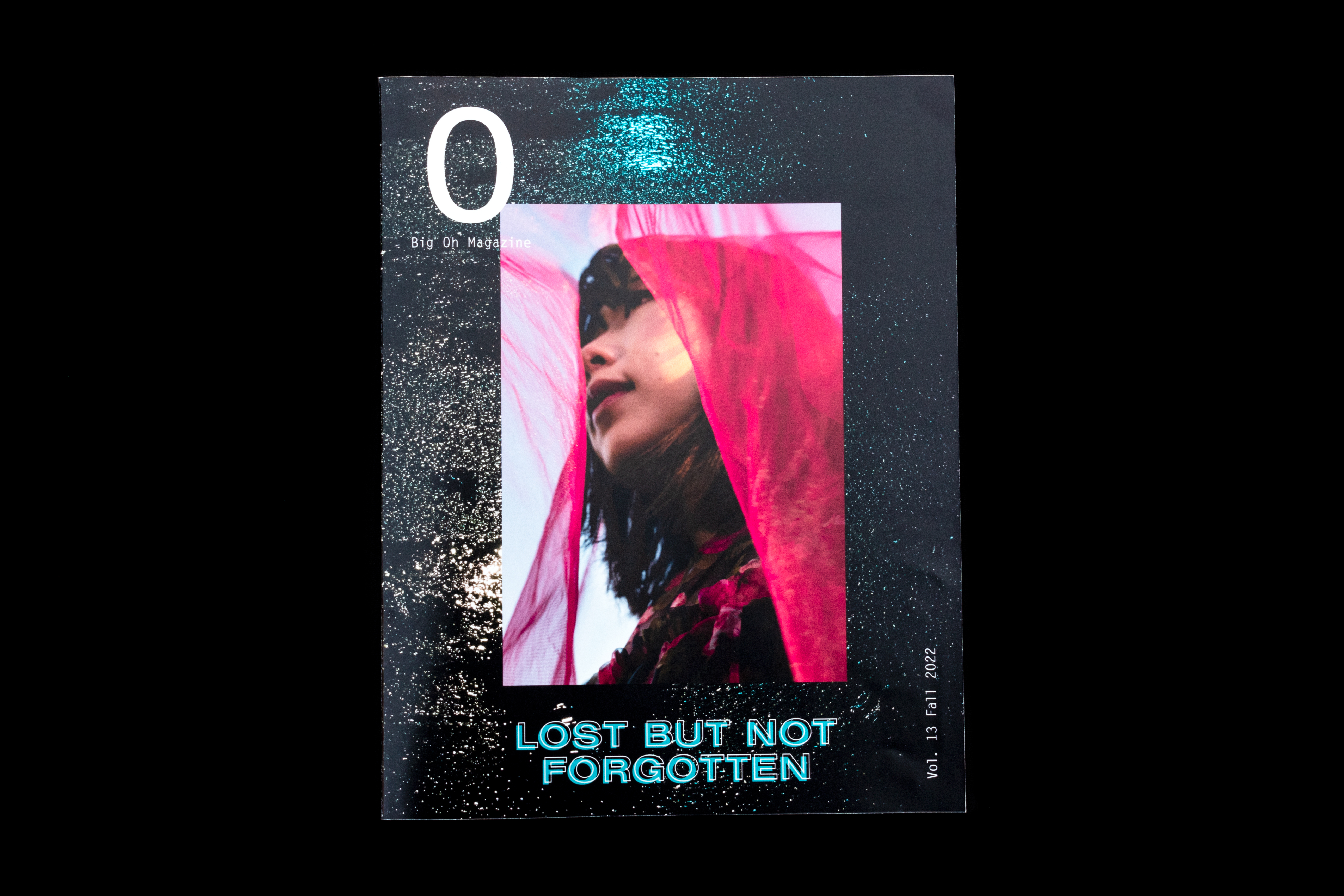
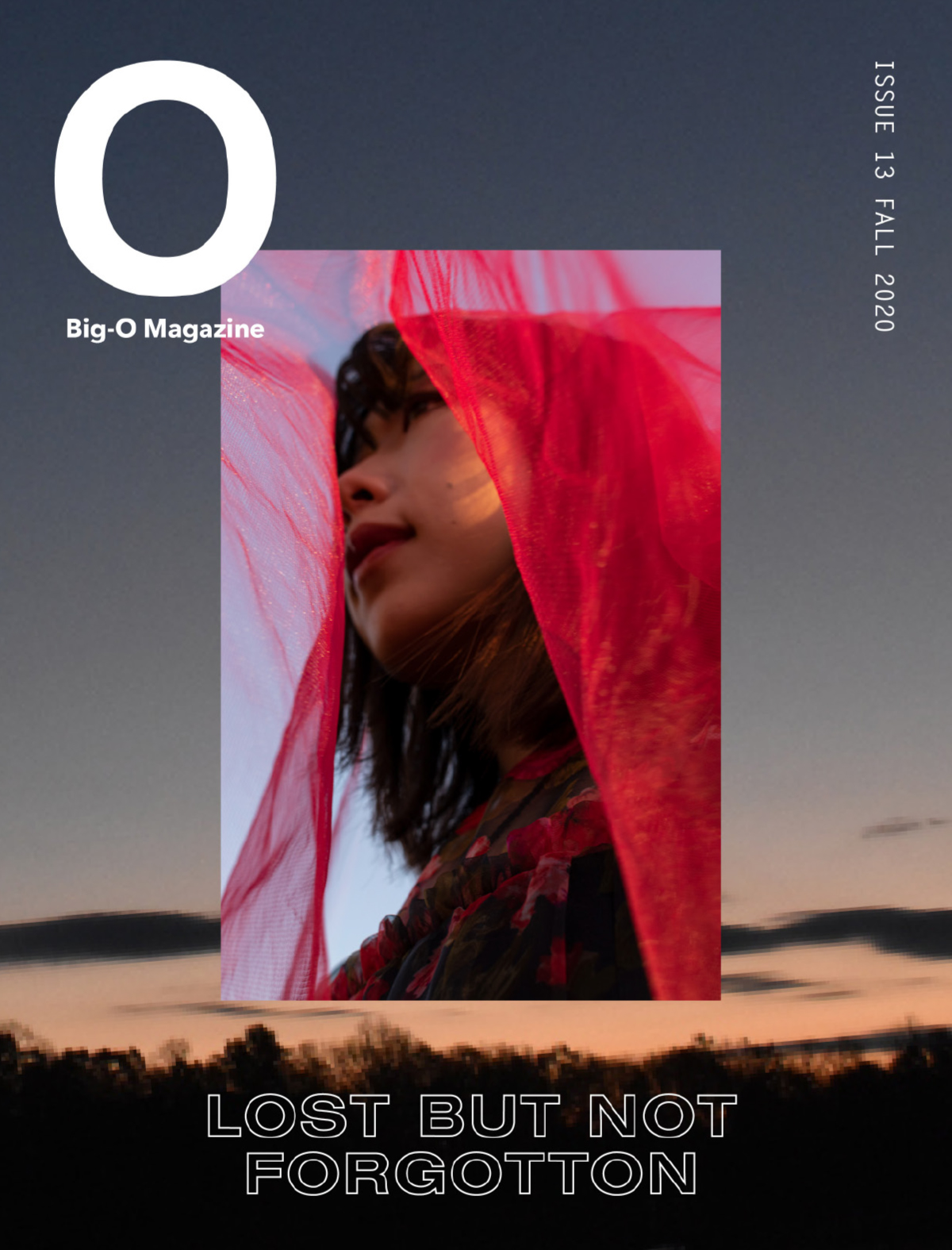
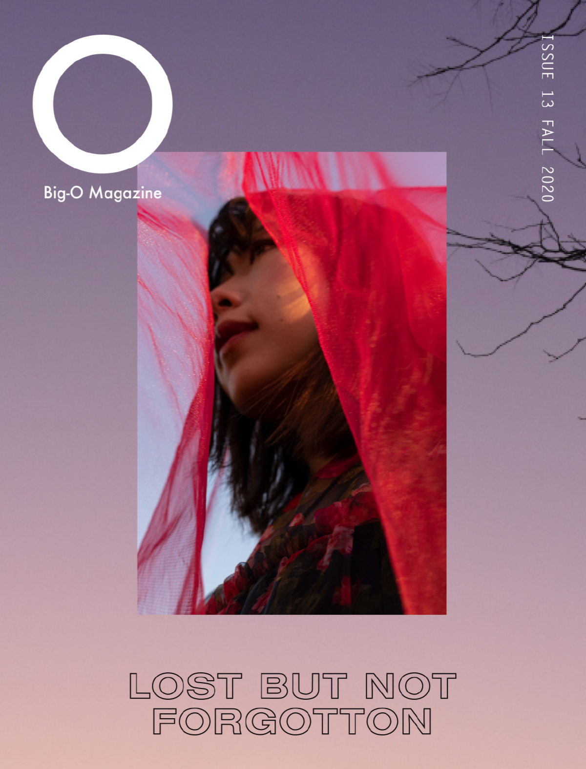
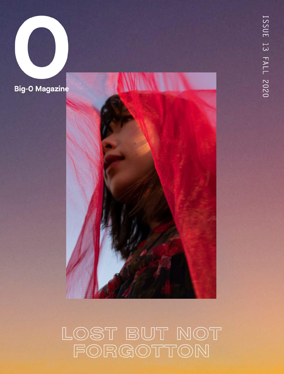
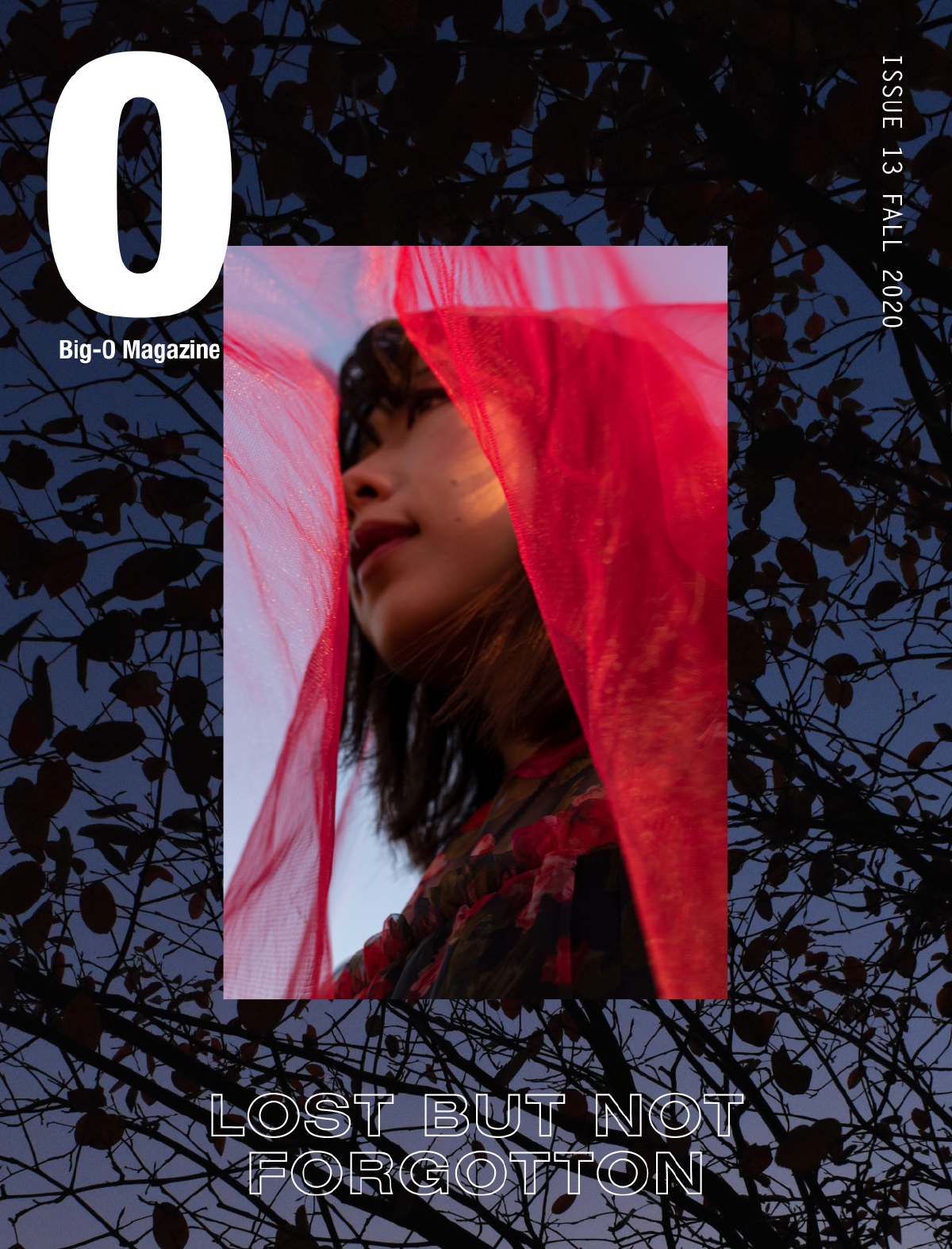
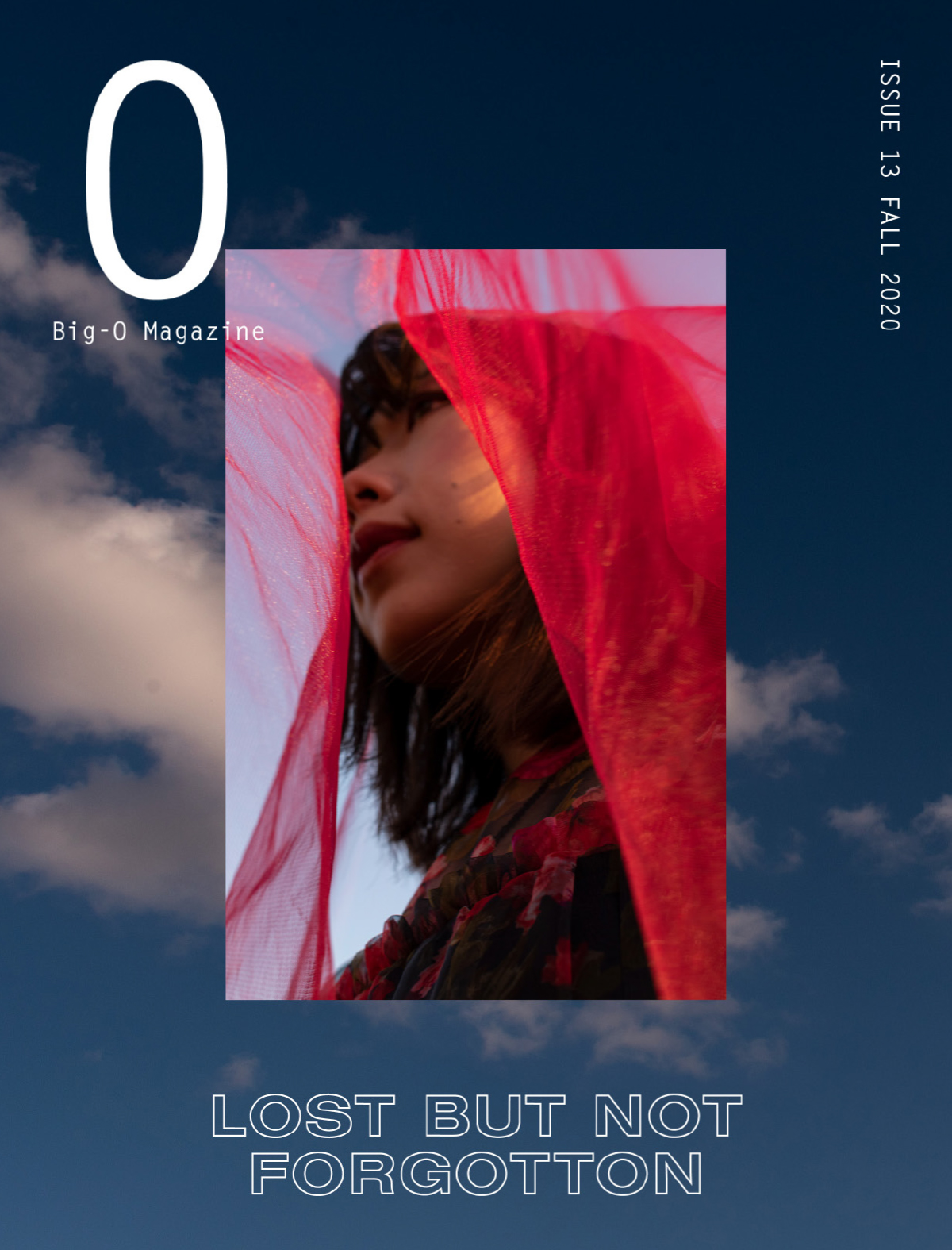
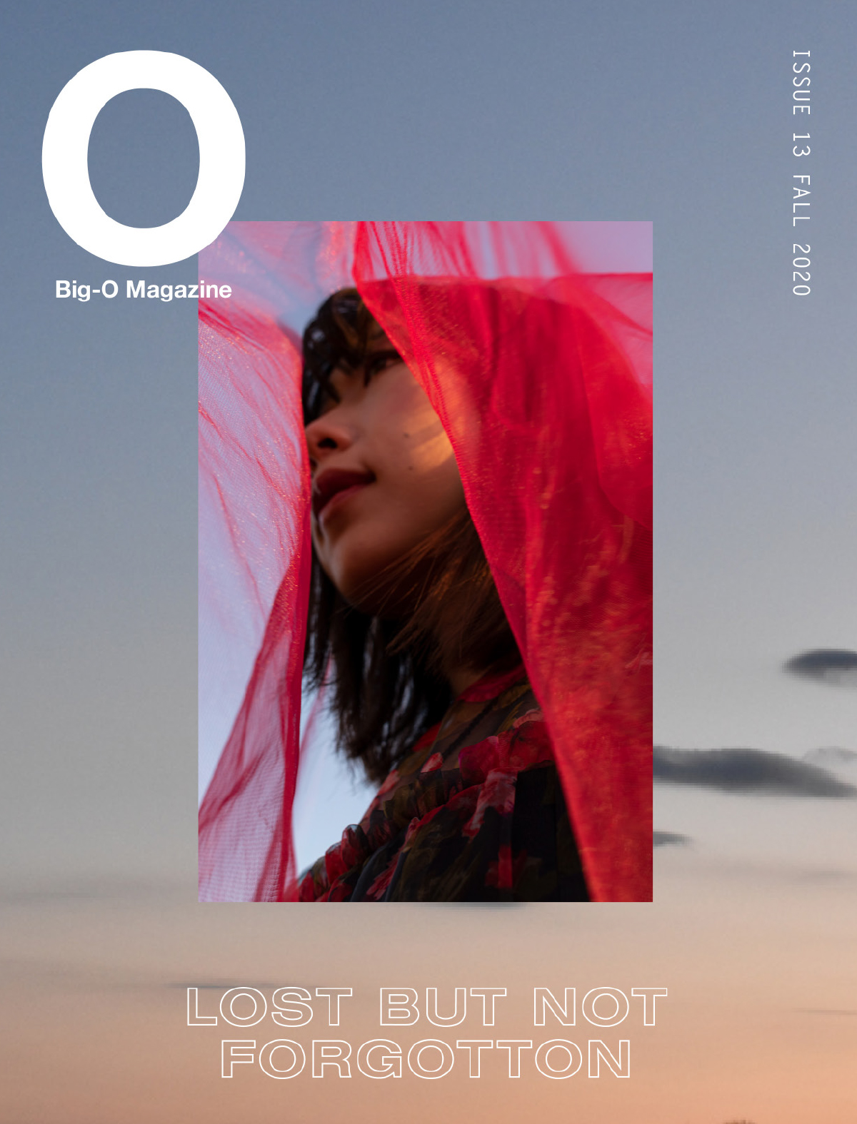
The layout of the spreads mimic snapshots arranged similarly to a scrapbook, like the viewer is looking back into a memory. I chose a monotype for the clothing descriptions because it is reminiscent of a script, and the outlined-type of the titles reinforces the idea of transparency. The turquoise type on the last spread ties back to the front cover. Multiple versions of the front cover were ideated before choosing the final cover, which communicates the tone of both the beginning and end of the story. The title of the magazine, “Oh Magazine” alludes to the discontinued alternative music magazine which Tan used to submit work for, B.I.G. O (Before I Get Old) Magazine. It also relates to O Notation, which is a mathematical concept for calculating time complexity.
This project allowed me to develop skills in multiple areas of design as I was responsible for all lighting, styling, make-up, photography, typography, layout, printing, and art direction.